Some thoughts about the first assignment. As I guessed, many of the products presented are quite familiar with us. We even had 3 classmates presenting about 1 same thing: the bench at MRT stations (guess many of us use MRT, right?). It's easy to see that bad designs are almost everywhere...
In the second lesson, we've learnt that a product can produce 3 different levels of experience, namely:
- visceral: the first stage, the first impression that strucks us
- behavioral: the second stage, when we learn about its function, usability, reliability, how well it can perform... These are the factual properties of a product
- reflective: the third stage. This is where the society has its effect. How will others think about me when I use this product? What can this product tell about me? Marketing campaigns and advertisements will help to form this in customers' minds.
Now I will need to choose a product to illustrate this...your guess? operating systems =p Sound like boring things huh?
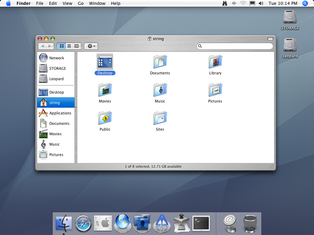
1. Our beloved Windows:-
In the second lesson, we've learnt that a product can produce 3 different levels of experience, namely:
- visceral: the first stage, the first impression that strucks us
- behavioral: the second stage, when we learn about its function, usability, reliability, how well it can perform... These are the factual properties of a product
- reflective: the third stage. This is where the society has its effect. How will others think about me when I use this product? What can this product tell about me? Marketing campaigns and advertisements will help to form this in customers' minds.
Now I will need to choose a product to illustrate this...your guess? operating systems =p Sound like boring things huh?
1. Our beloved Windows:-

- visceral: well yes, windows is not tooooo eyecandy, but its graphic user interface is not that bad, right? (compare to, say, Unix which doesnt have a GUI=P)
- behavioral: you might have heard too many compaints about Windows's performance, but dont you wonder why it's still the most popular OS although ppl hate it so much? well, it's easy to use, most softwares are compatible with Windows. Even my friends who are using Mac still need to use Windows parallelly. So I think that I can say this is where Windows is strongest.
- reflective: not much to show off. Everyone has it, so you are not that special. Even worse, the Apple ads potraited PC user as boring people.
2. Mac OS: I believe that emotion for this product is most affected by marketing/ads and its loyal users. Gonna show you now.
- visceral: I'm gonna give it a 'yes', for Apple's OS is famous for its eyecatching GUI (however, I have to say sometimes, marketing/ads can also interfere what people think is beautiful. Let's say if everyone around you say "any product from this company is so cool. It's designed for style", then eventually it will affect your emotion also.)
- behavioral: I haven't used it. It's agreeable that its performance is good, but yet again, many people overrated it. I've heard people to say something like "a Mac never has any virus", and it's not true. Also, not every software is Mac compatible.
- Reflective: young, punky, ... anything related to 'cool'.
3. Linux:
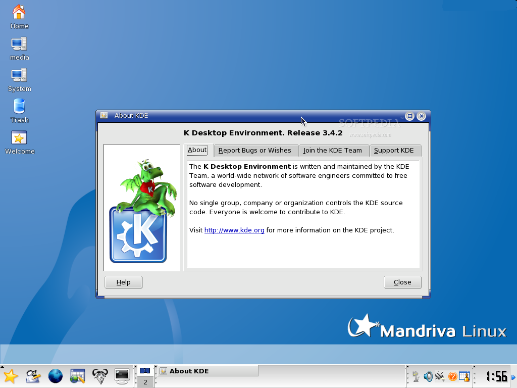
- visceral: nothing special compared to Windows :P but it's not bad.
- behavioral: based on my friends' comments and reviews from internet, Linux has much less virus and much more stable. however, it does not support many softwares, and some of them are pretty popular. One of its biggest advantages is that it's free.
- reflective: it's a change from Windows. The user who use Linux may considered themselves as more computer savvy. They can also feel that they are supporting open source software, which seems to support the freely development of technology.
So that's it. Depending on users' requirement, they may choose different products for different reasons. A business man would prefer Windows, I guess, for its popularity and being easy to use, while a young student may like Mac OS for the cool factor, and finally a computer geek would rate Linux among the best.
